Making a Home Their Own
This client’s home had always been a space for hosting friends and a growing family, but it wasn’t reflective of their own style or taste. To make the biggest impact on the home, we focused on 3 key areas – the kitchen, the bathrooms and the foyer.
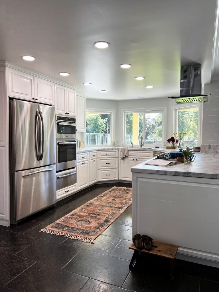
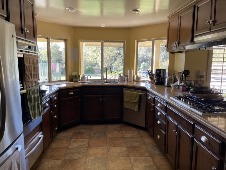
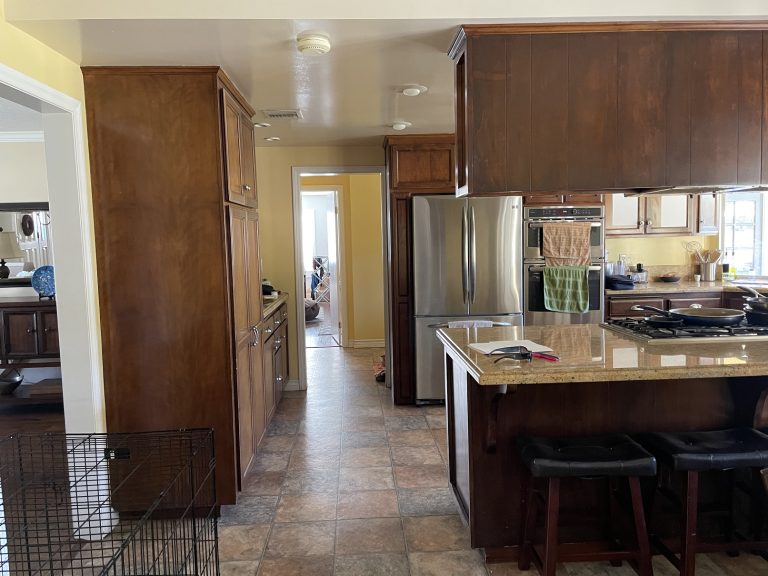
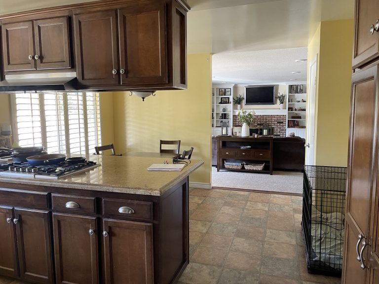
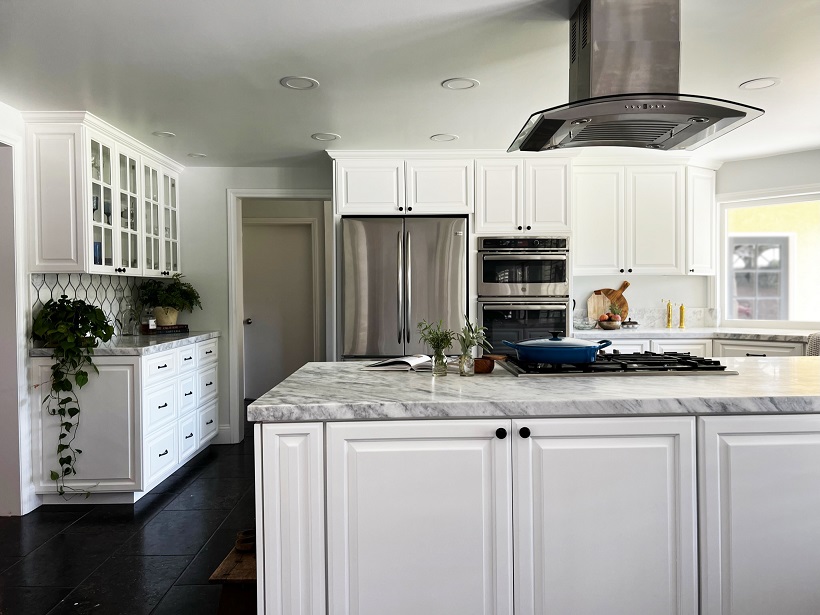
Like many kitchens of the early 2000s, this space was dominated by dark cabinets, vinyl sheet flooring and warm yellow tones. These features made the kitchen feel dark, heavy and closed off. While the homeowner didn’t want to completely reconfigure the floorplan, there were a lot of minor changes we could make in order to open up this space.
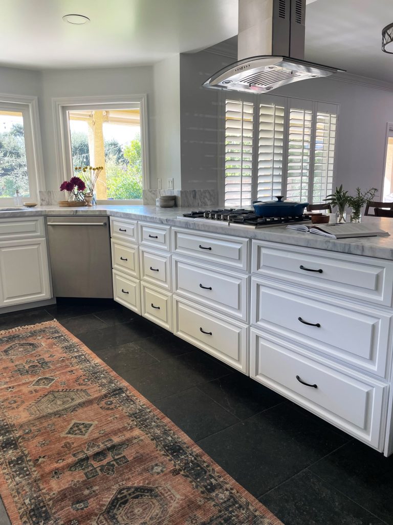
One of the best parts about this kitchen is that we kept a lot of the original foundation. The cabinets were originally built with high grade plywood and solid wood fronts and side panels. Using the original boxes allowed us to expedite the reconfiguration of the kitchen. We removed part of the cabinet faces and replaced then to reflect drawers rather than doors with pull out shelving. We removed the clunky cabinets over the range – these closed off the space visually and were inconvenient in terms of storage. Next, we tackled the island – originally this was used as a seated bar. This client rarely used the island’s bar seating, so as a better use of space, we extended the counter top and installed custom shallow depth cabinets where the seating once was. To improve the flow between the formal dining room and kitchen, we widened and centered the opening between the two spaces, allowing for more light and a more open feel and relocated and deepened the pantry. Finally, we added a coffee bar area and enclosed shelving to maximize the storage and function of the space!
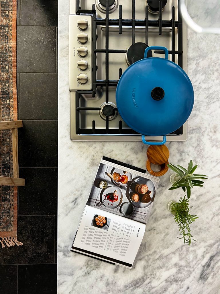
Something that makes this space truly unique is its use of natural stone. For the countertops, our client went with a gorgeous honed quartzite – more durable than both marble and granite, quartzite is a gorgeous natural stone that features distinct veining, ranging from solid to crystalline. We went with a beautiful honed and detailed Calacatta backsplash as a focal point under the upper glass door cabinets. As for the floor, our client introduced us to a material we had never used before – Belgian Bluestone. This is a unique limestone imported from the southern region of Belgium. What makes this stone so unique is its history – which you can actually see on the stone! Embedded in this stone are ancient fossils, coral and calcite veins, which against the stormy gray of the natural stone is visually striking. We replaced all of the doors and drawer fronts with solid wood raised panels and sprayed all finishing items creating a soft and beautiful finish
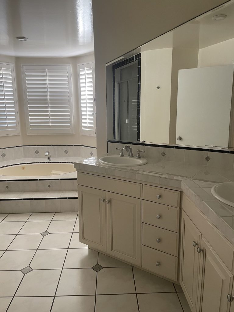
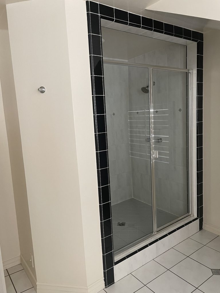
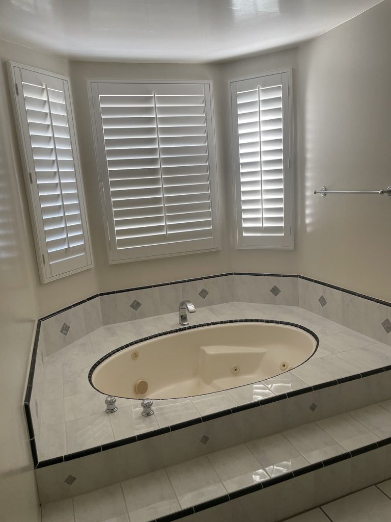
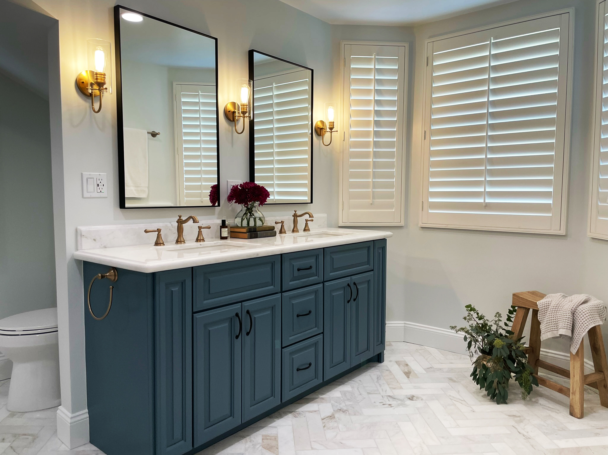
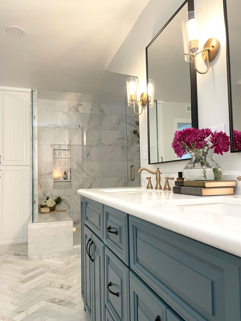
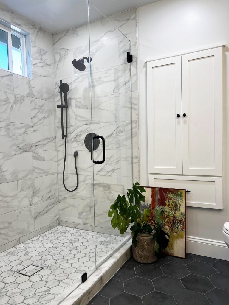
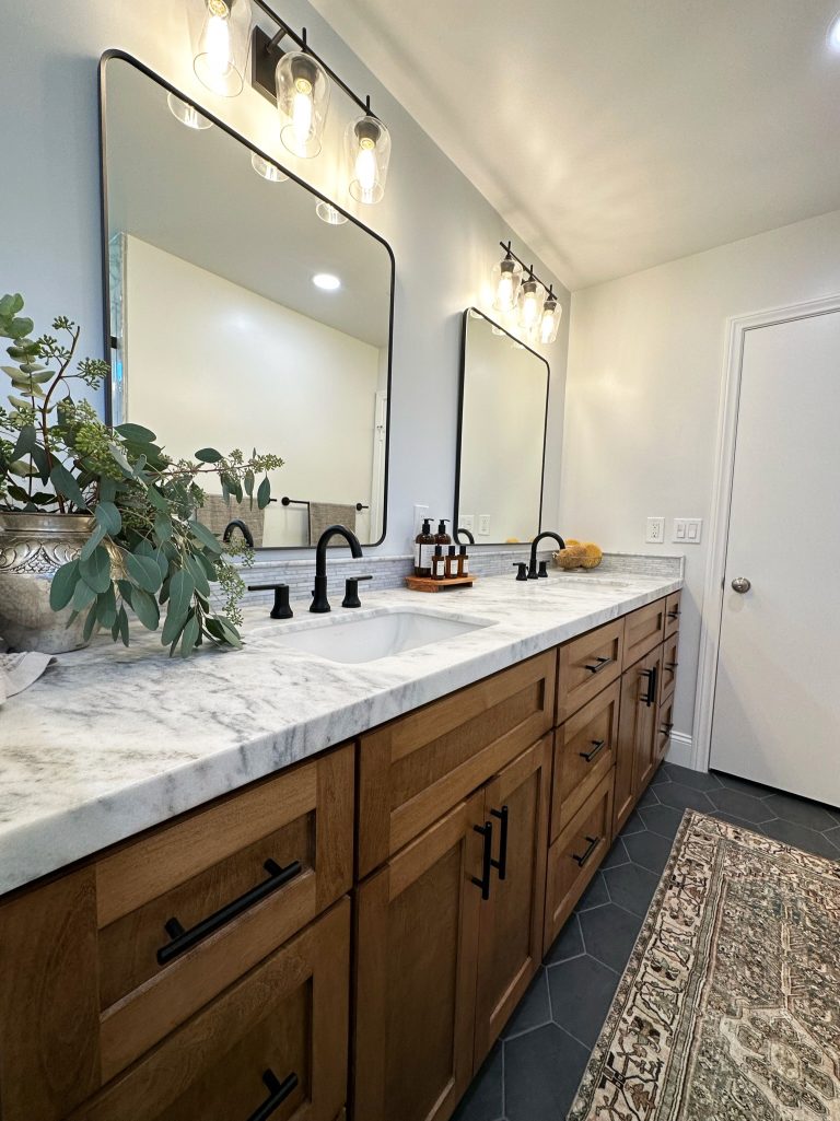
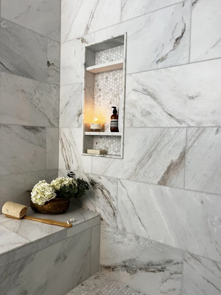
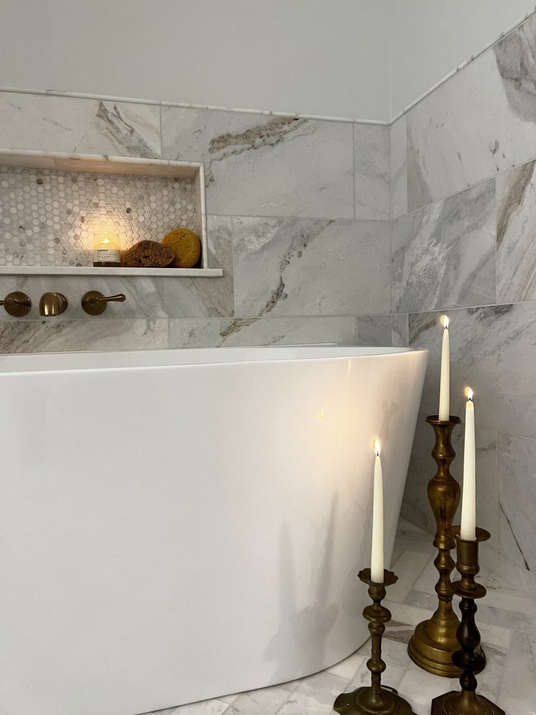
As you can see from the before photos, this bathroom is very spacious, but awkwardly shaped. To maximize this space, we completely changed the layout and reframed the room, creating straight lines and removing the odd, angular shape of the old vanity wall that limited the layout. Once reframed, we were able to use the extra space for custom recessed cabinets, using dead space behind the wall and providing the clients the storage they didn’t know existed. From there, we went from the floor up! One of our favorite features of this space is the incredible marble herringbone floors – The timelessness of the marble instantly elevates the atmosphere, providing a sense of opulence that resonates throughout. Continuing with the shower, we removed the wall that closed off the shower and created an open feel with a marble bench providing seating and a place for the new glass to sit on, bringing in even more visibility and natural light. We used honed penny marble tile for the flooring and accent feature in the niche bringing in more personality without having to change the continuity of the marble bathroom as a whole. To tie the entire space together, we introduced champagne bronze and matte black finishes along with a beautiful custom-built blue green raised panel vanity complimenting the natural hues within the marble stone throughout—small details that make a big impact
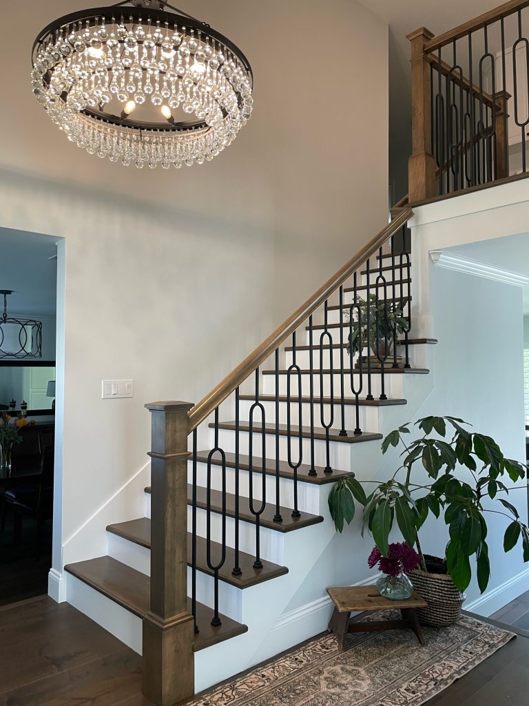
Moving on to the foyer – as this is the first space seen when entering the home, we wanted to make sure it complimented the home well while still having its own personality. To do this, we focused on the stairs. To keep the space from becoming too heavy, we went with white stairs with wooden tops. This not only brightens the space, but creates visual interest! To highlight this further, we also put in a custom handrail that lends a sense of fun to the space. Finally, we installed a gorgeous, modern chandelier to bring the whole space together!
