Withstanding the Elements
Some projects are just meant to be! We had been working on a midcentury kitchen remodel across the street from this home for several months, and we’d always look at this house and think “wow, that house is so cool”. Well, the universe must have heard us, because shortly after, the homeowners caught us outside and asked if we could take a look at their master bath project.
The house itself had burnt down in a big fire back in the 90’s, and when it was rebuilt it was constructed to be fireproof (hence the cinderblock walls and steel framing construction). It was a unique aesthetic and although the current homeowners loved the house as a whole, they were ready to update their master bathroom and create more of a space that suited their personal style.
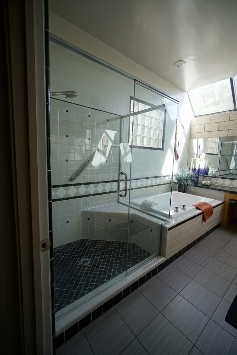
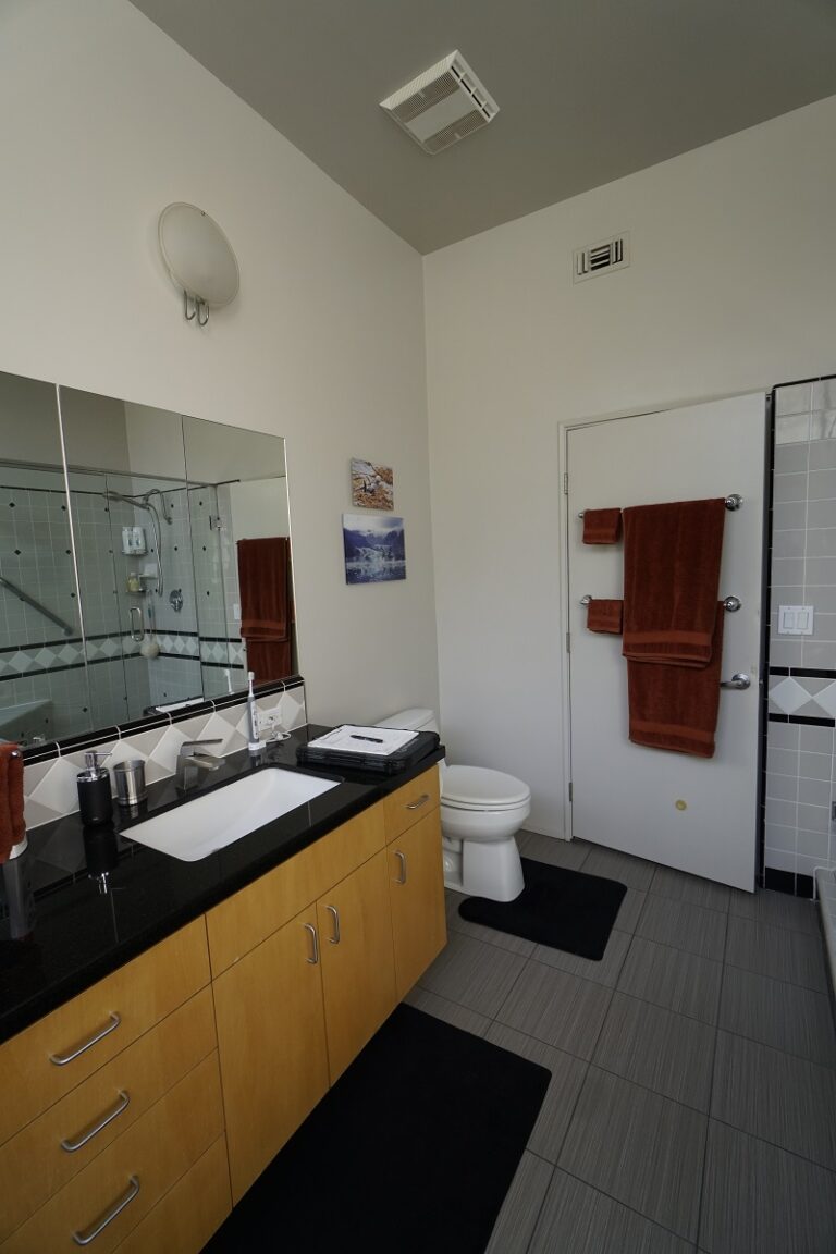
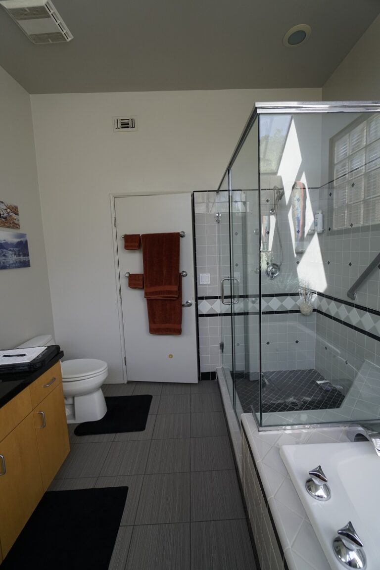
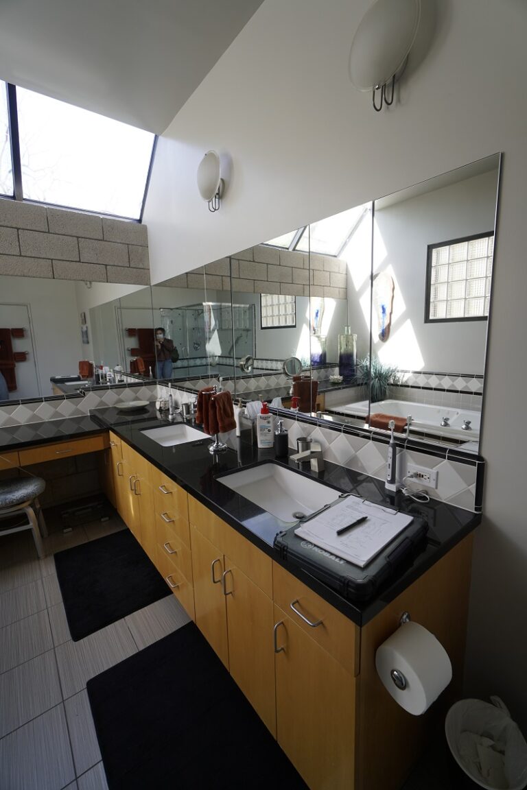
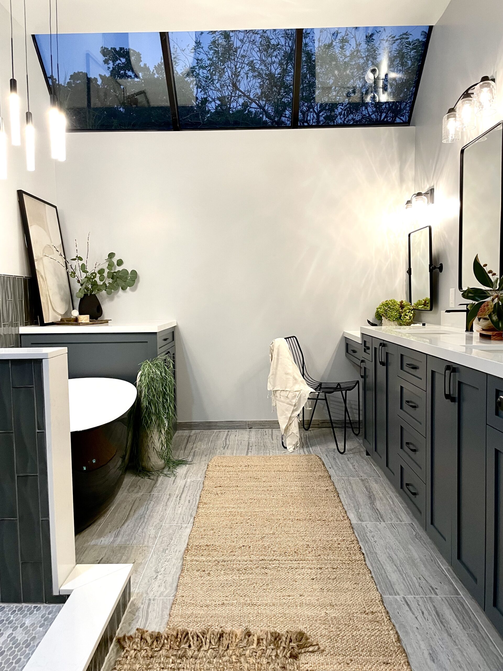
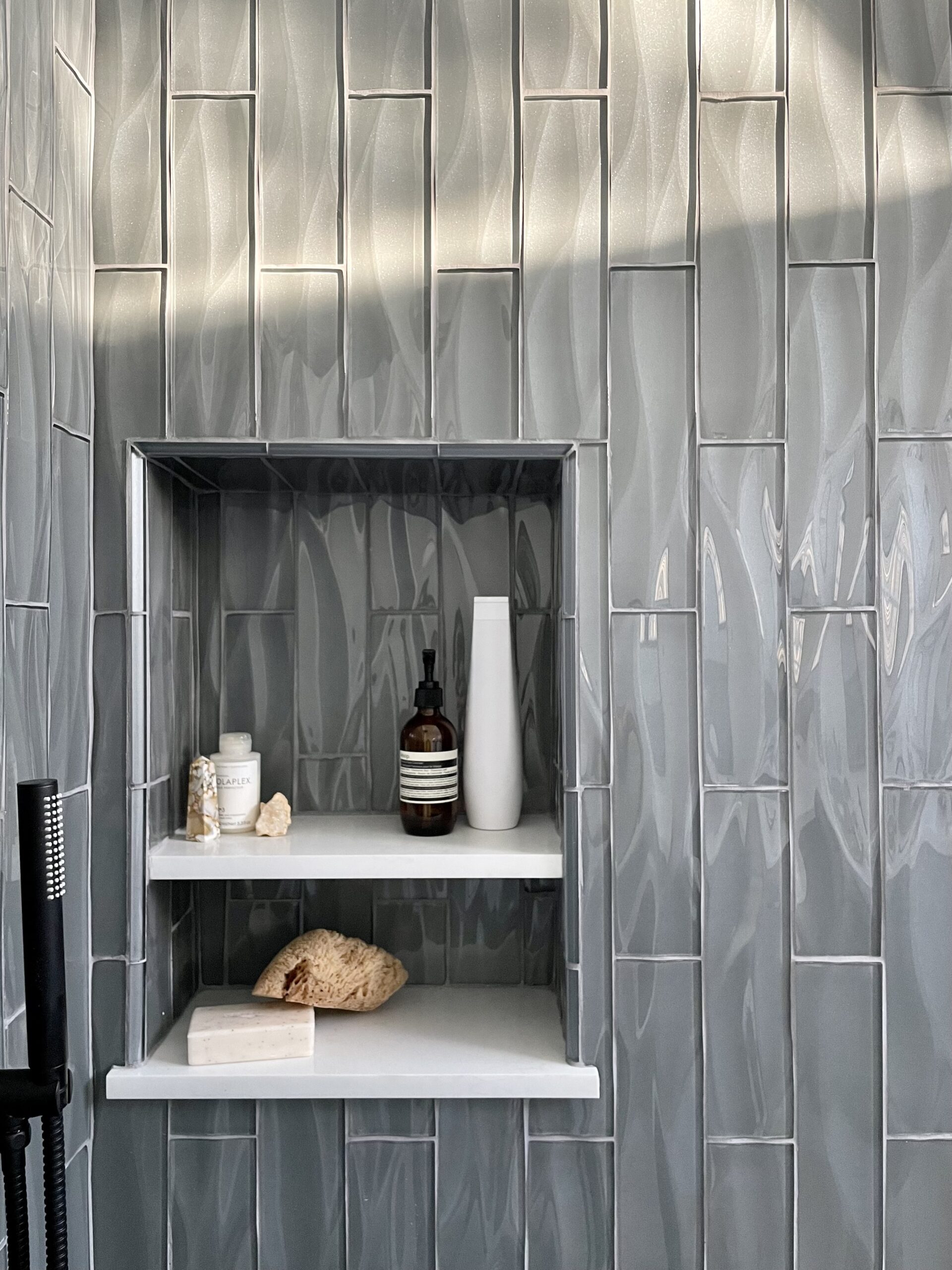
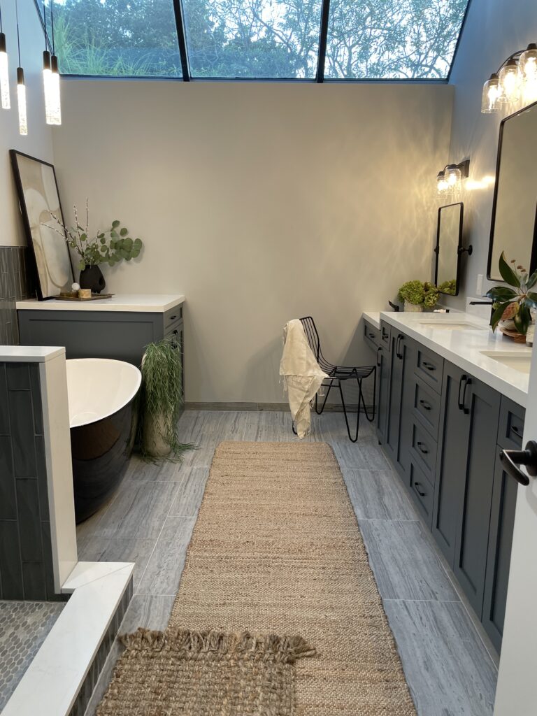
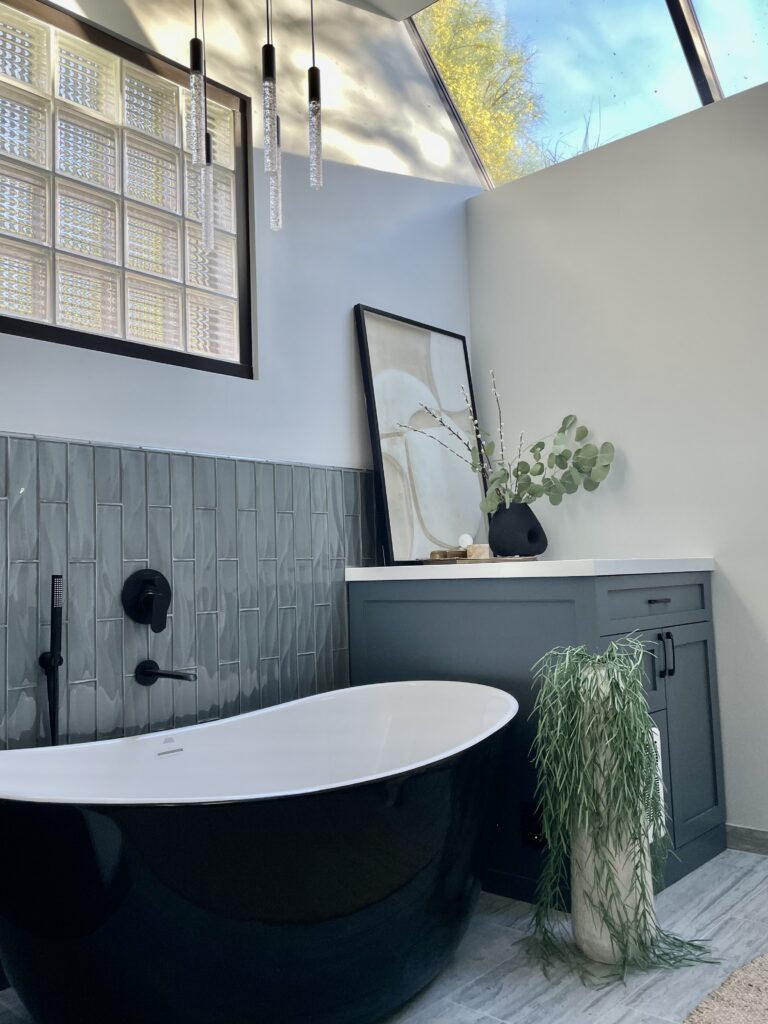
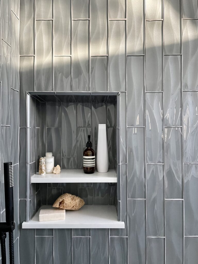
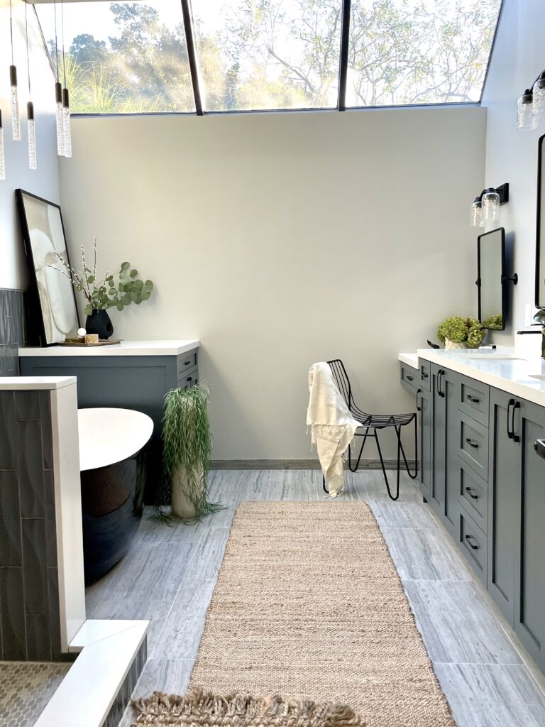
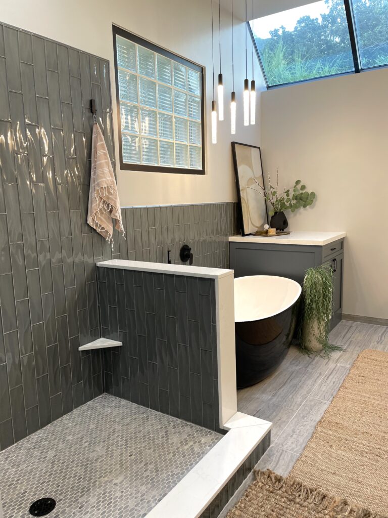
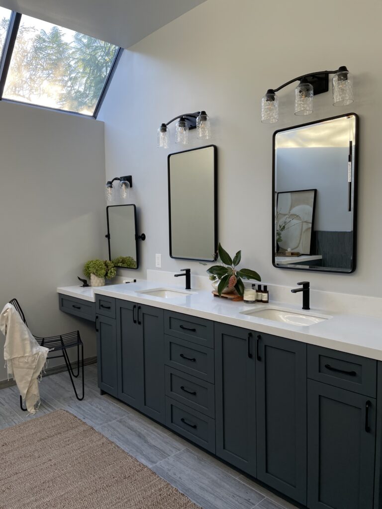
The home has consistent characteristics throughout – steel frame windows, primarily cool tones, and unique artwork and treasures that had been collected through life. We wanted to create a space that felt updated yet still married to the rest of the home (which can be challenging for very specific spaces). We decided to go with a beautiful glass wave tile for the walls and a honed linear marble floor tile. When the light comes in through the ceiling window it illuminates the glass tile on the walls bringing new dimension to the space, and the linear marble tile fits right in with a more structured industrial yet organic feel. The vanity was a custom build which we built in-house and we finished it with a satin lacquer which has a lovely appearance and feel to it. The free-standing tub was custom with the two-tone finish, and we even added a hidden wall heater in the lower cabinet. Since the ceilings are so high in the bathroom, this small unit provides that little bit of early morning warmth when you get out of the shower or tub.
One of our favorite finishing features in this bathroom are the light fixtures. The industrial modern chandelier over the tub not only provides visual appeal and light, but it doesn’t obstruct or limit the natural light coming into the space; a key visual variable! The glass shades on the vanity lights cast a beautiful shadow on the walls bringing even more dimension to the space itself.
Overall, this was a really fun project and it was great to see cooler tones in a space without it looking all overly monotone. Natural components of glass and marble are a high contrast to the more industrial feel of the overall home yet fit in perfectly. Also, ceiling windows and extra tall walls for the win because, wow, do they make this space feel extra special!
