A Little Slice of Zen
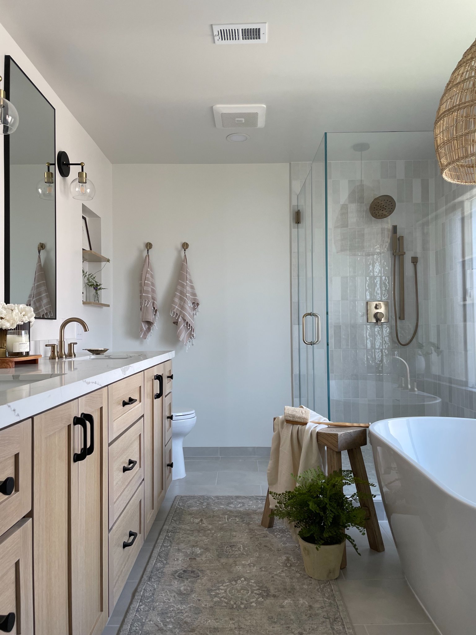
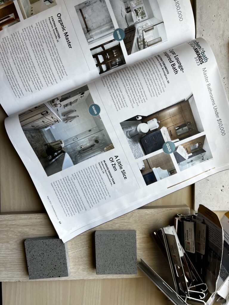
Not only is this one of our favorite bathroom transformations to date, but it also earned us Silver in the 2023 Kitchen and Bath Design Awards!


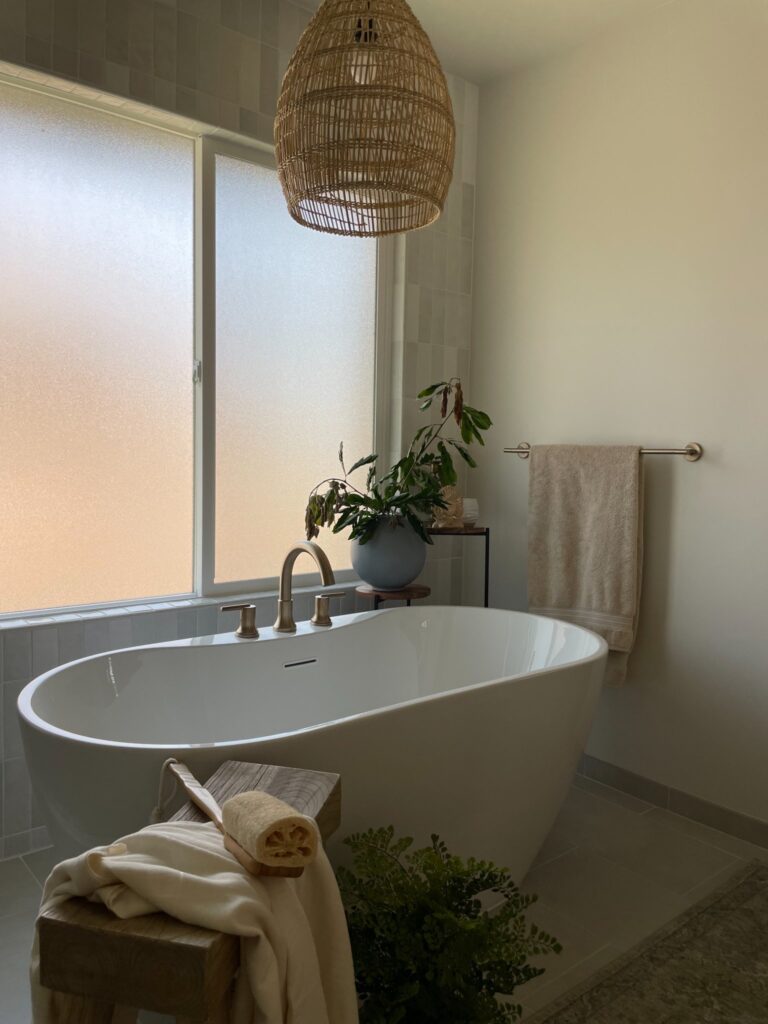
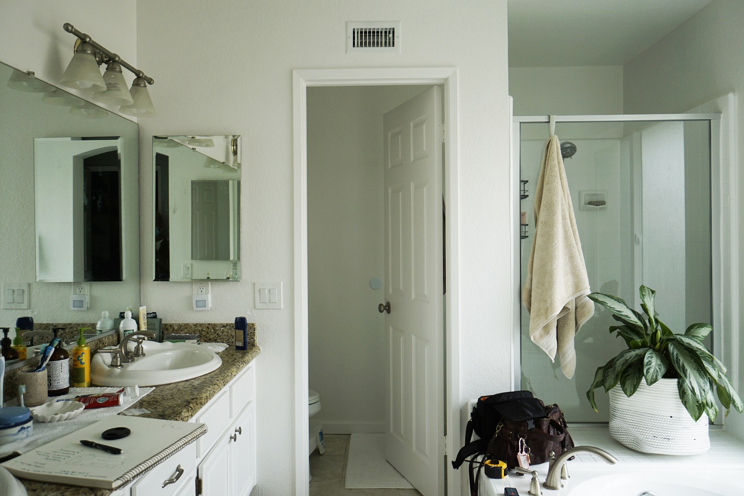
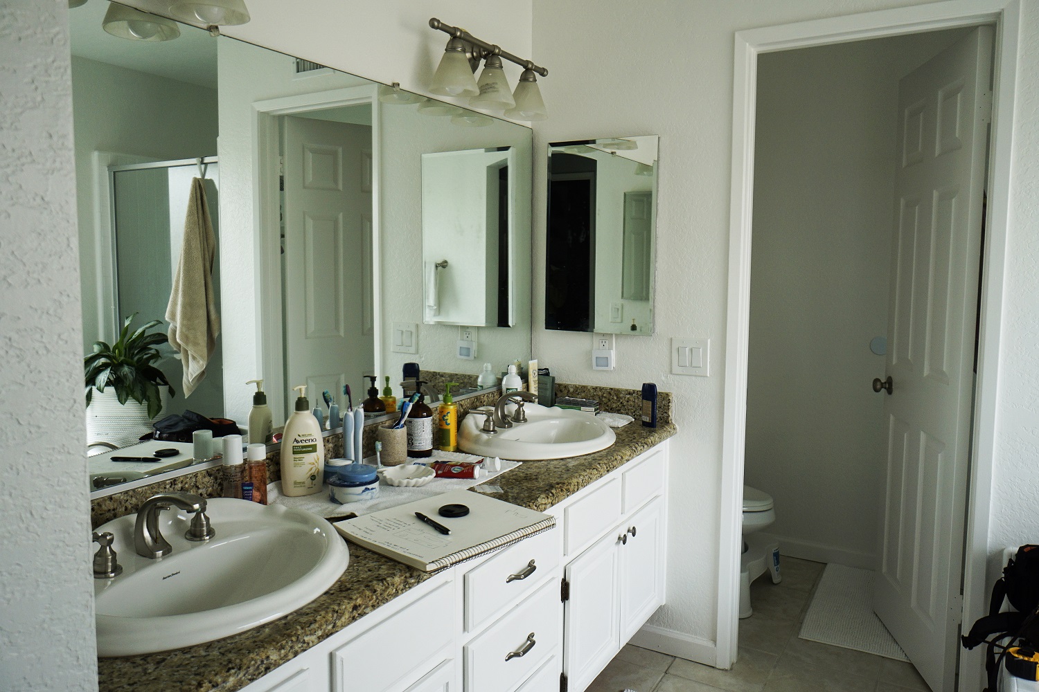
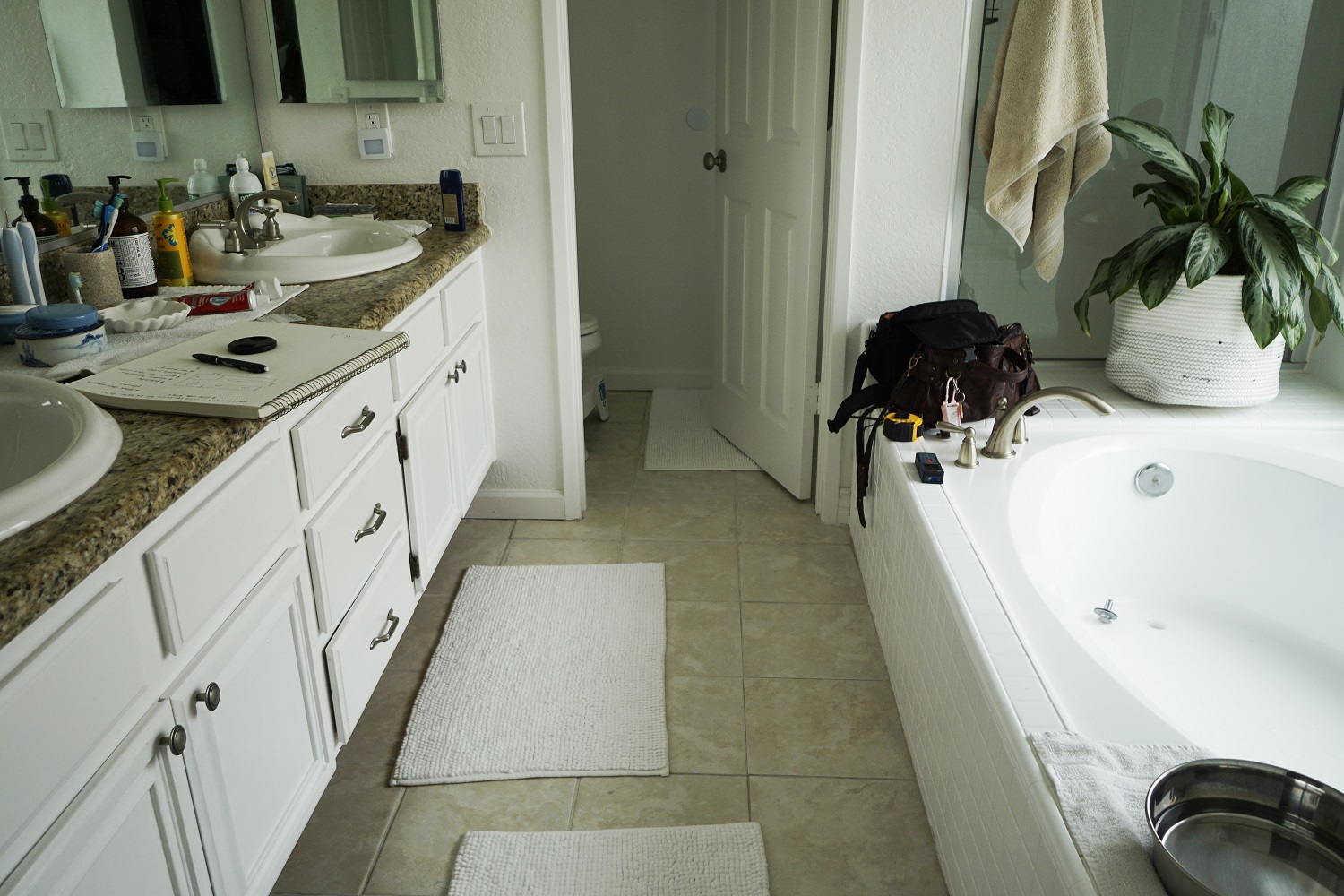
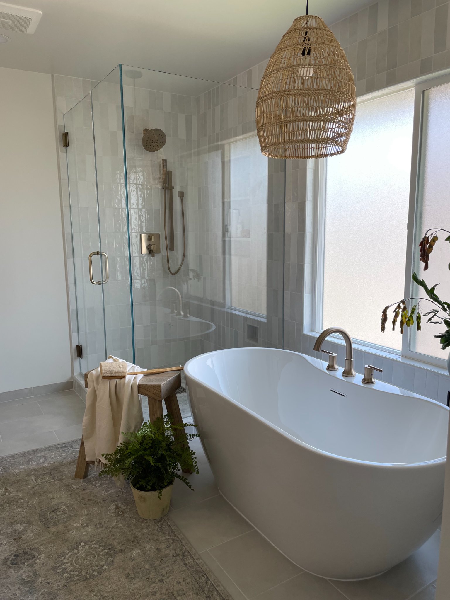
To start off, we removed the awkward dividing wall between the vanity and tub space (scroll to the bottom to see ‘before’ pictures!)with the toilet and shower space; this alone makes the bathroom feel much larger and allows more natural light to reach the space as a whole. We went with a beautiful custom-built rift cut white oak vanity. We get a lot of people that ask about this vanity and other current “trending” wood options, and white oak seems to be a consistently desired option. Now, you might be wondering what rift cut means. There are three options when cutting the trunk of the tree: You have a plain sawn, quarter sawn and rift sawn
Rift sawn is cut in a way that only uses a certain portion of the trunk lending it to the linear grain that you can see on this vanity. We find all of the white oak cuts to be beautiful and the nature of the wood has more of a blue pink hue compared to red oak which has a more golden, yellow and red undertone.
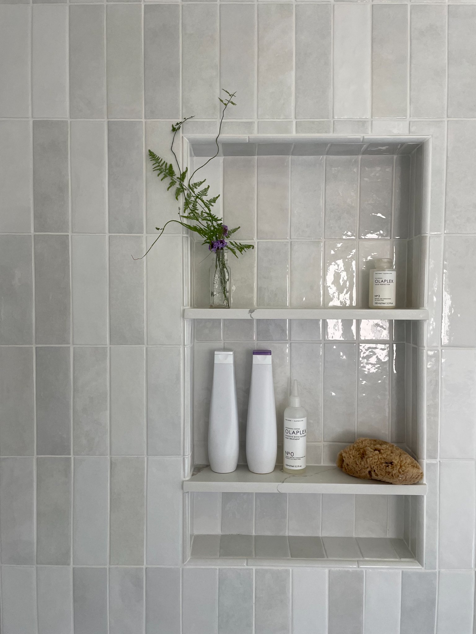
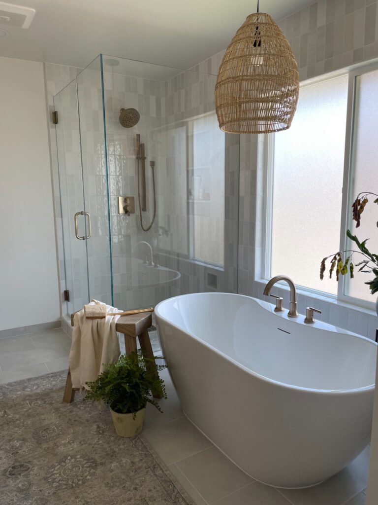
Moving forward, we went with a vertical subway pattern that carried over behind the tub and around the window (going full height tile is always a good choice as it elevates the space as a whole), brushed gold faucets and a beautiful free-standing tub. The natural and earthy woven pendant brings it all together.
A lot of people have a hard time with finishing décor, wondering if they can mix and match light fixtures and hardware and we say: absolutely, go for it! There is a lot that goes in to mixing and matching but when you get it right, it makes the statement pieces stand out rather than blend in. The vanity sconces are more modern-industrial while the pendant is boho and they totally compliment one another! Just like fashion, don’t be afraid to step outside of the box, just make sure it’s the right balance and you’ll have a stunning and unique space.
